BRIEF // After experiencing great growth, the start-up cider guys at Harvard brought on investment and wanted to move out of ol’ Harvard itself and into central Boston, MA. Choosing to redefine the name from the infamous university to Prospect Ciderworks, we also decided it was a chance to try out some new colours for the ciders, and a more urban look.
The guys wanted to keep the deep and unusual stories to each cider, which always got a great response from customers, so the goal was to simplify and streamline each existing piece and switch up the illustration style to something bolder and more colourful.
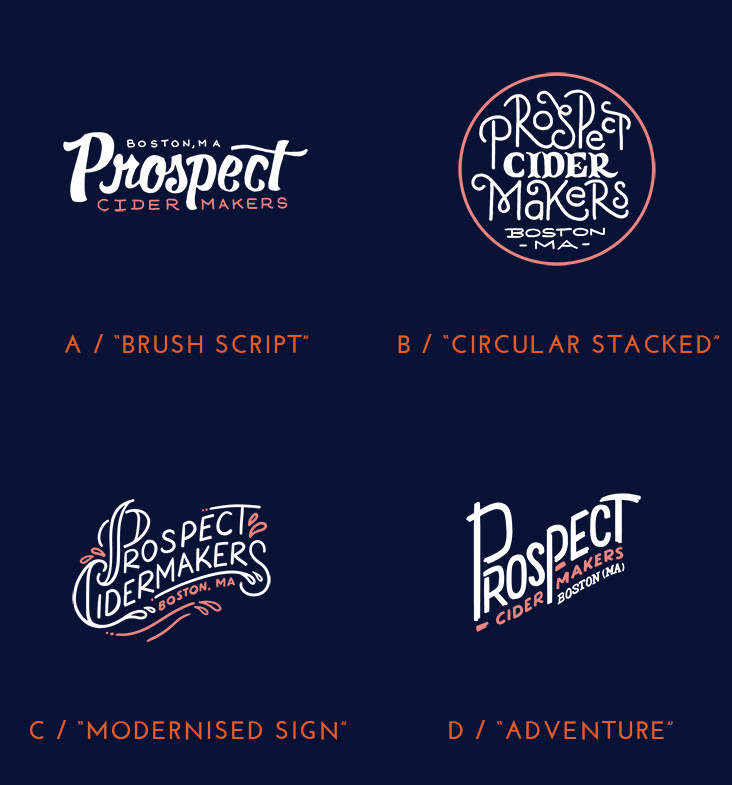
Logo developments. A and B are hand-drawn logos by Mary Faber from Faber & Lo who kindly helped out.
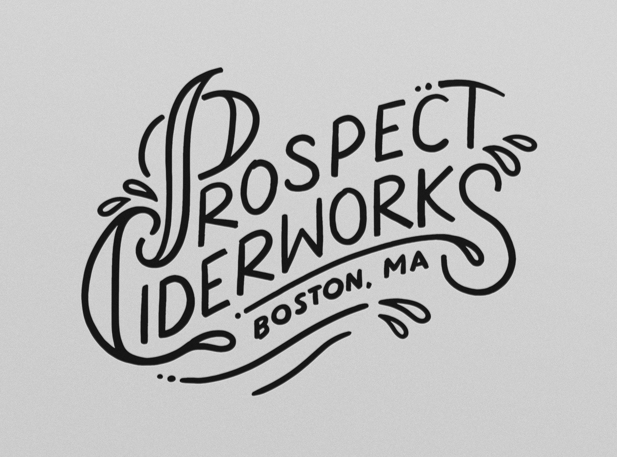
The final logo, a old-as-new handwritten logo with a subtle pick-axe and lots of liquid.
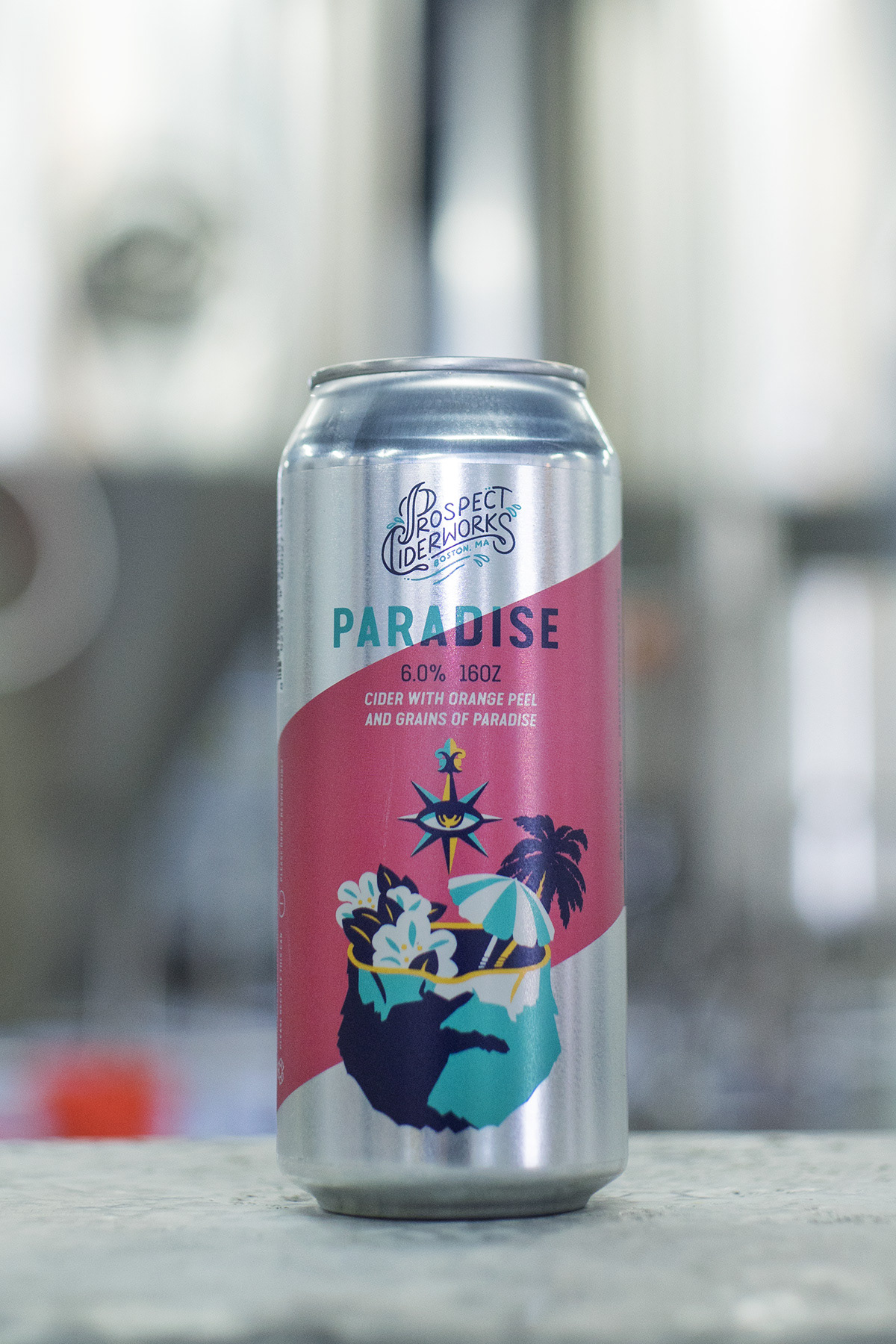
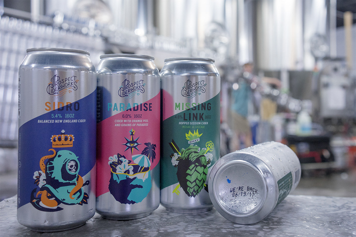
Paradise retained it's classic name and concept. Photo courtesy of Prospect Ciderworks and Chase Brooks.
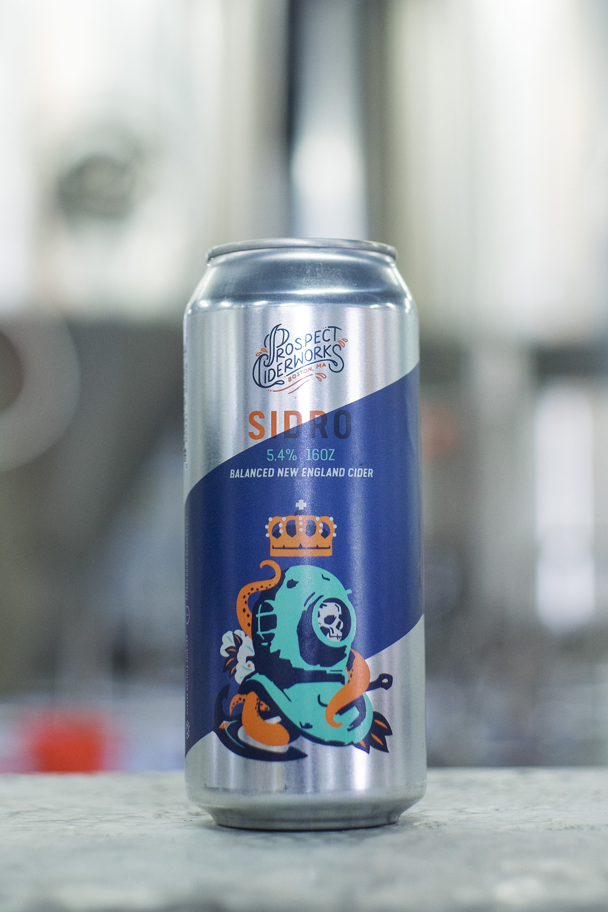
Sidro, previously know as Anchor. Photo courtesy of Prospect Ciderworks and Chase Brooks.
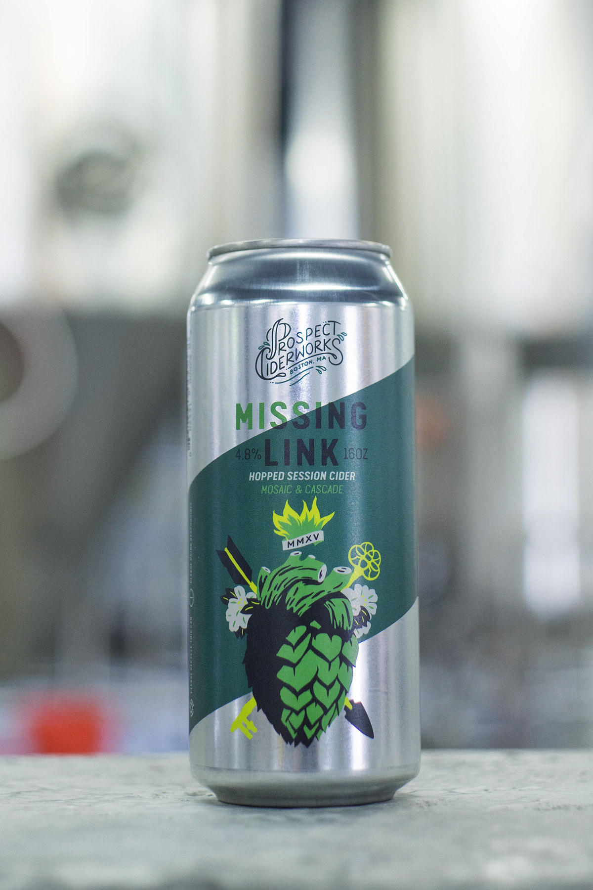
Missing Link retained it's classic name and concept. Photo courtesy of Prospect Ciderworks and Chase Brooks.