
BRIEF // An ambitious new drinks format for a crowded American drinks market brought Qula to our door in search of a bold, ‘hell yeah’ solution. Tim worked with the Qula crew to find the why of it, the things that excite and inspire them and the best approach to grab consumers attention.
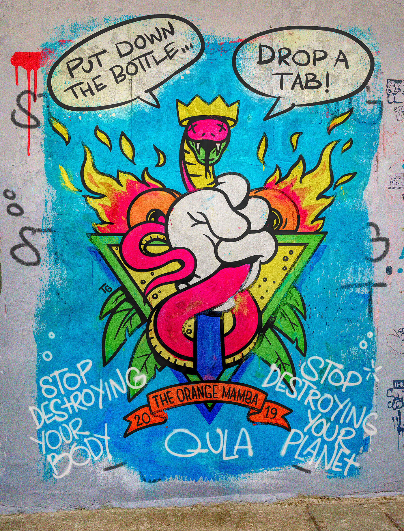
Each Kombucha flavour was associated with an inspiring creative clic, from 80s/90s Venice skate pioneers to Ska and Reggae musicians, Laurel Canyon hippies, or Peyote vision questers. Illustrators from around the world were head-hunted for their concept-cohesiveness, beautiful art was made and then everything was wrapped in a bold but clean branding wrapper.
The ultimate goal is to help get Qula fans healthier with Kombucha goodness, while also avoiding the impact production, shipment and refrigeration of glass and single-use bottles normally used by the drinks industry. Change your Water - Change your World.

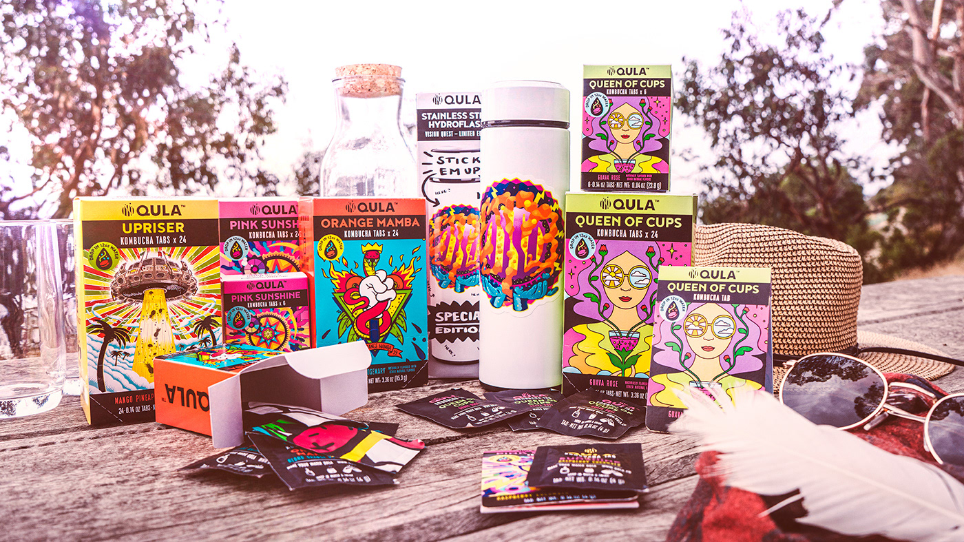
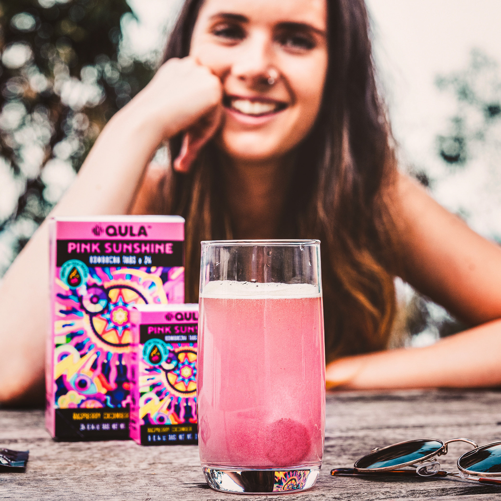
The Kombucha goodness is locked into effervescent tablets, sealed in single packs, and then offered in a variety of form factors from single sleeves, to 6 and 24 packs. Snap by Fold in the Map
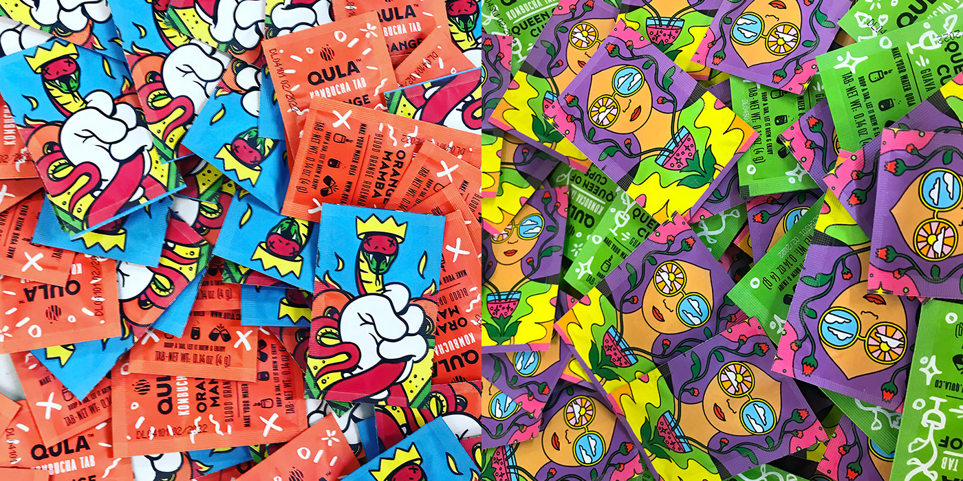
Each Kombucha tablet is sealed in a flavour sachet to give them long-life and enable a bit of rough handling in pockets, bags or transit.
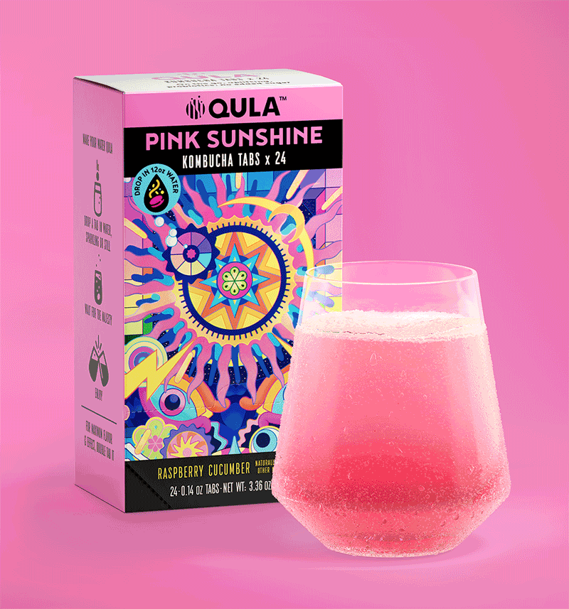
Illustrator credits: Pink Sunshine: Pablo Espinosa, Queen of Cups: Lan Tru, Upriser: Toby Morris, Orange Mamba: Tim Gibson
Special thanks to the Qula creative founders, Nathaniel and Becs.
Fold in the Map, showing us how it's dome
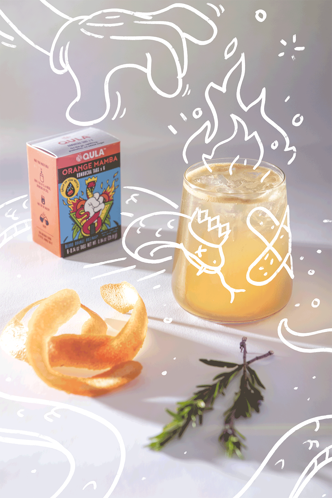
Photo by Nicola Edmonds, animation by Flying Whities

With such strong and unique 'flavour-art' one of the challenges was how to create semi-cohesive brand messaging without paint ourselves into a corner, and staying nimble enough to work with new styles and looks in the future.
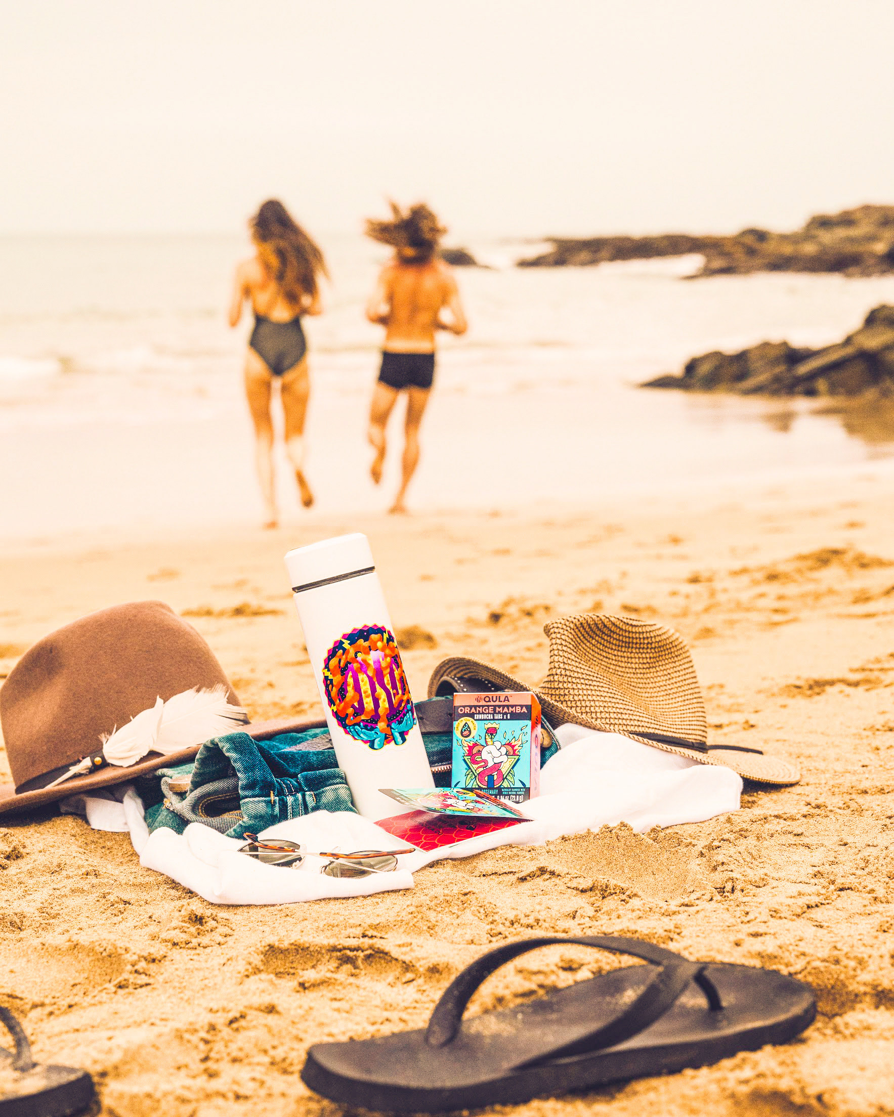
Travel light, travel right. Photo by Fold in the Map.