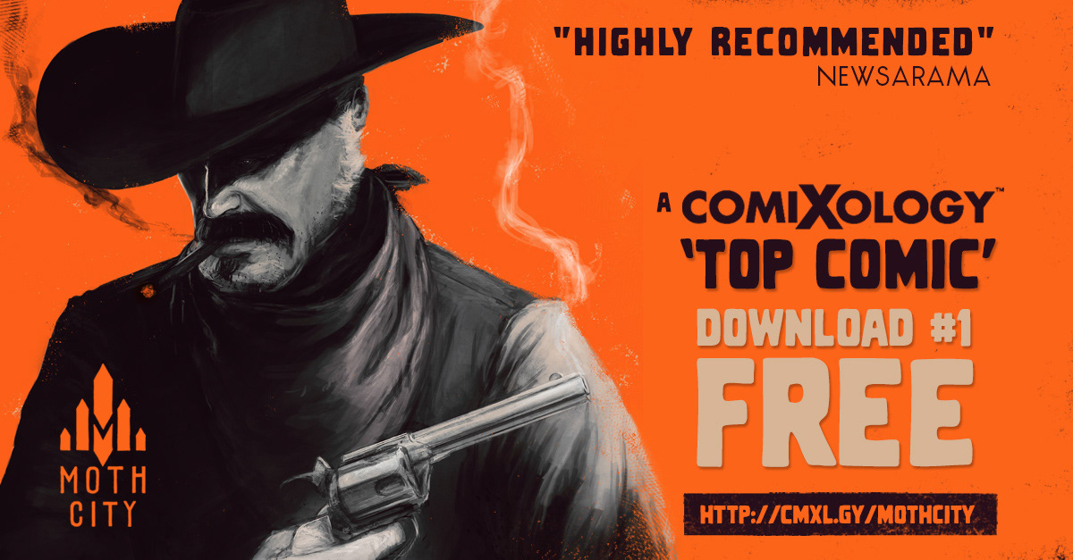
BRIEF // Moth City is a digital-native graphic novel, that uses the best of comic's narrative techniques and new digital platforms to tell a dramatic, suspensfull story at the reader's own pace. It needed to back up it's anbitions by being available broadly, online and via mobile, as well as in digital storefronts like Comixology.
Distinctive branding needed to make it recognisable across mulitplle platforms, and strong graphic design is essential.
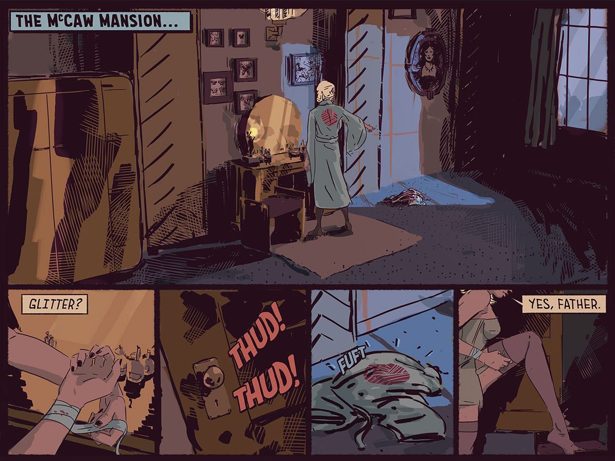
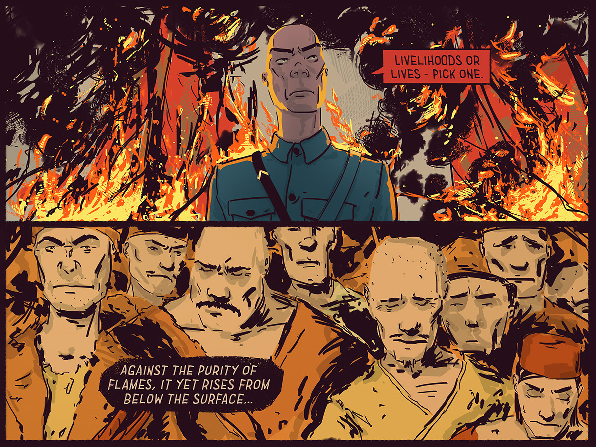
Illustrations are modern with a period comic flavour; classic flat colouring, strong inks and simple compositions and framing. Tan is used in place of stark white, and a deep inkish purple used in place of black.
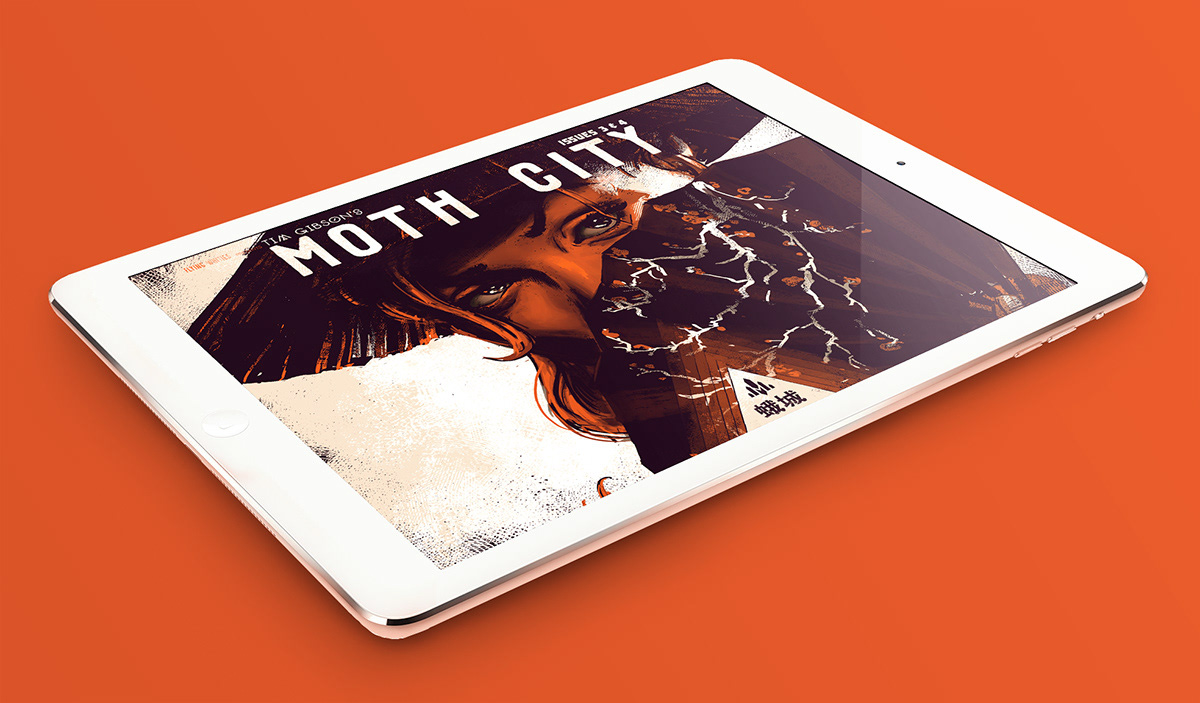
Moth City is part of the burgeoning digital-first comic movement, part Webcomic, part issue-based serial, part animation. You can download the first issue, for free at Comixology.
Moth City's pages are formatted as stackable 4:3 blocks, allowing optimal screen coverage on monitors and tablets, as well as combining to form portrait sized pages for print. A similar approach was often used in European comics that appeared both in serialised newspaper versions, and in collected print editions.

As a digital comic, Moth City reacts to reader’s swipes or clicks by presenting new story information (like new dialogue bubbles or changing artwork etc), giving a sense of reader-driven animation & suspense.

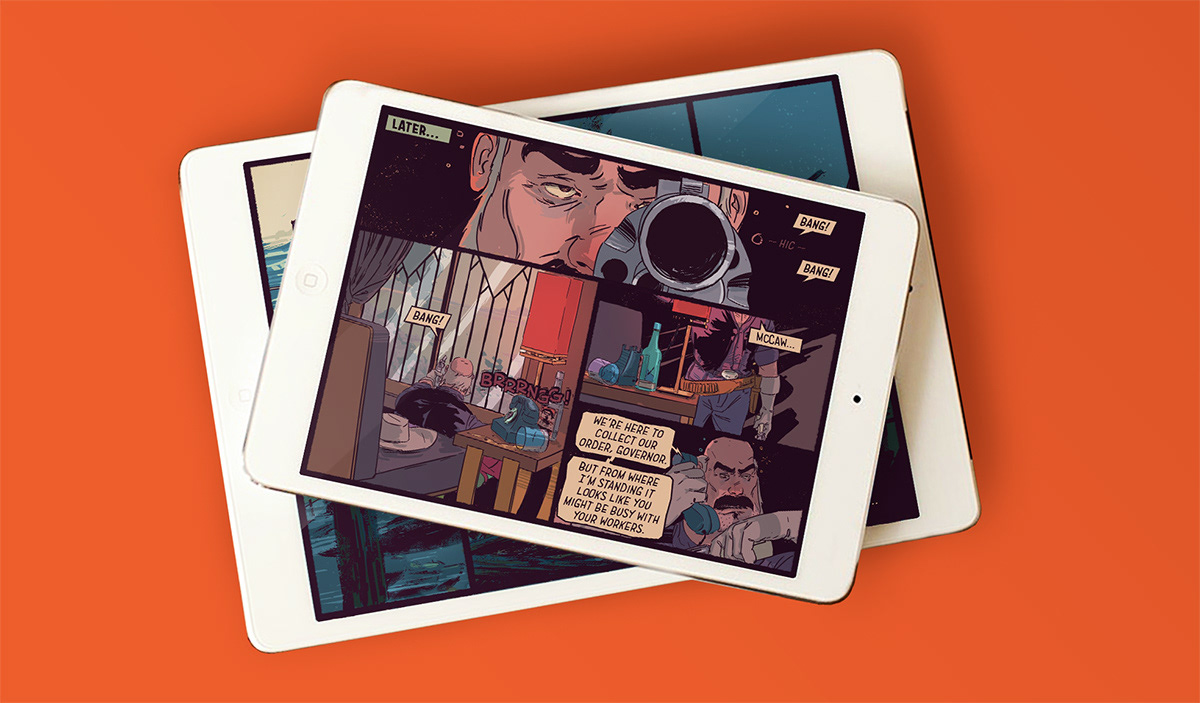
Experimentation has taught me that even though digital storytelling is limitless, traditional comic reading behaviours should still be observed, such as left-to-right progression in both speech bubbles or visual information. The content of a panel can be changed, or have elements added and subtle animation can be added to characters poses or facial expressions.

It's not all about action, animating dialogue exchanges adds cadence to dialogue and allows characters to act via timing or changing expressions. Some of my favourite exchanges take place between the thuggish Governor of Moth City, and his morbid mortician, seen above.
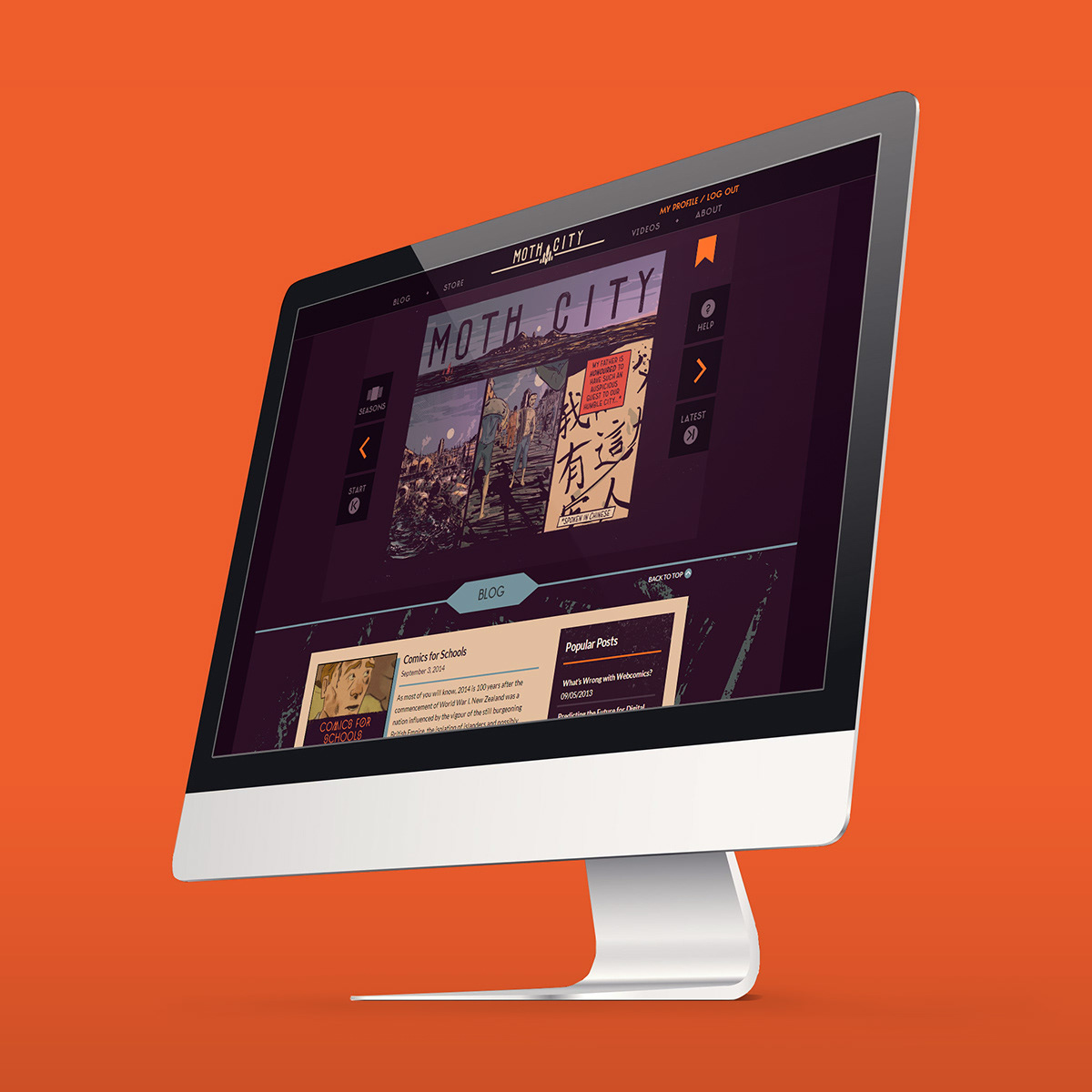
Moth City has one of the few bespoke webcomic builds out there, allowing not only the digital-animation that the comic is known for, but innovations such as auto-bookmarks, moderated comments and dynamic social media buttons that appear at the conclusion of the latest instalment.
The site was designed from the ground up by Steven Holt (@ Flipmo) and built by Mark Webster.
The site dynamically adapts to different resolutions, ratios and orientation, meaning that readers of tablets can access the same content, in a format designed for their platform.
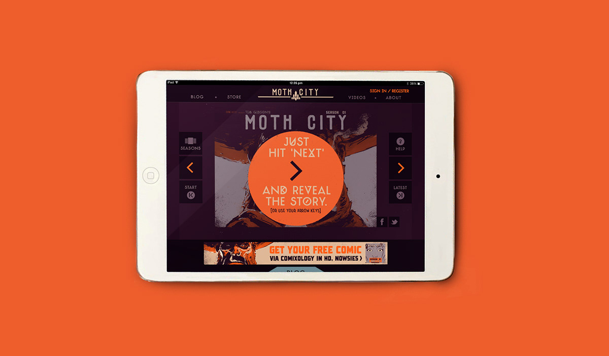
The website looks great on tablets in both landscape and portrait mode. It even looks good on phones, but really, please don't read my comic on a phone.
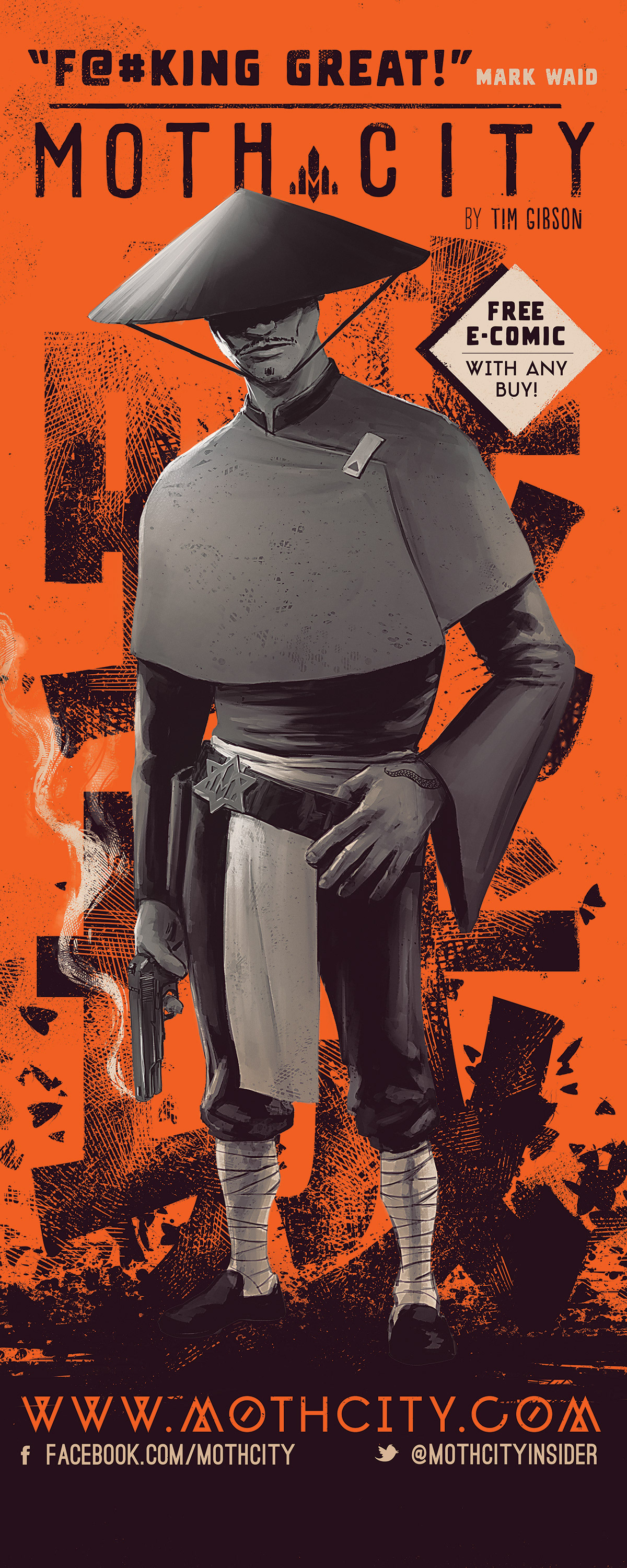
Banner design - for convention appearances, featuring Lui, stands over 6ft tall. This project was created in a similar way.
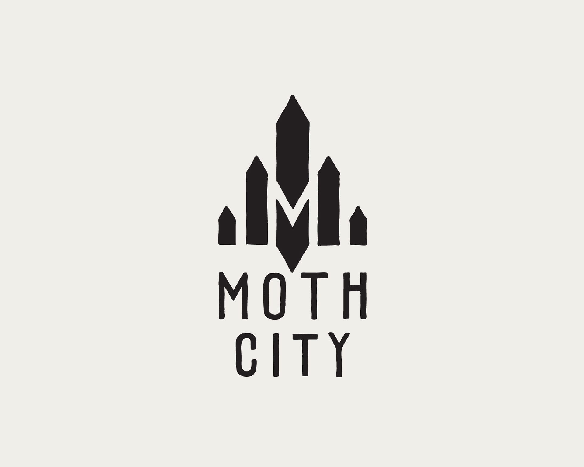
Logo design - reminiscent of a city scape and the art deco movement.. Working designs are here.


Limited Edition Screen-Print.
Moth City allowed me to experiment with retro poster designs and authentic printing techniques like Screen-Printing and rekindled my love affair with the process.
This Screen is printed locally with premium materials and inks on a tan paper called 'bone'.
Boom. Thanks for checking out my work on Moth City. You can purchase issues, or try the first one for free here.