
"Tim was (and continues to be) the best designer we could ask for at Harvard Cider Company."
Chase Brooks - Co-Founder, Director of Marketing, Harvard Cider Co.
BRIEF // Three young Americans with disparate backgrounds set themselves the lofty goal of challenging traditional notions of hard cider. They wanted something with the boldness of craft-beer, the gravitas and history of Harvard, MA, and a family of designs that looked good grouped on a shelf, but with artwork as individual as the ingredients.
Inspired by old etchings, modern tattoos and the stories of the ciders, we set upon the task of pulling this into a cohesive brand and line of drinks. Oh, and did I mentioned that as a start-up there was no brand to speak of? Yeah, we did that too, working with the founders to build their brand from the ground up.
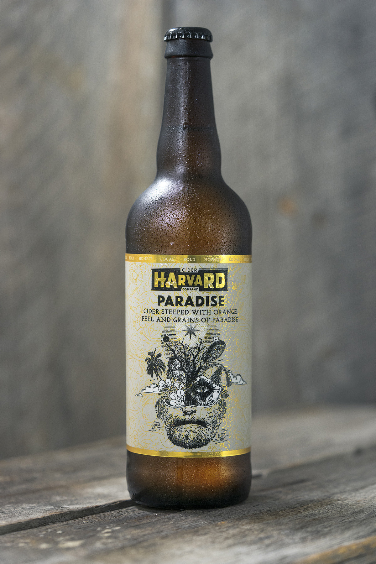
Photo courtesy of Harvard Cider Co.
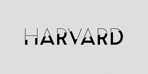
Multi-stage logo progression based on client feedback.


Paradise: 'A Belgian cider bearing multifarious aromatics and a peppery finish; Paradise is a distinct encounter for the cider drinker. Steeped with West African grains of paradise (black pepper) alongside California orange peel.'
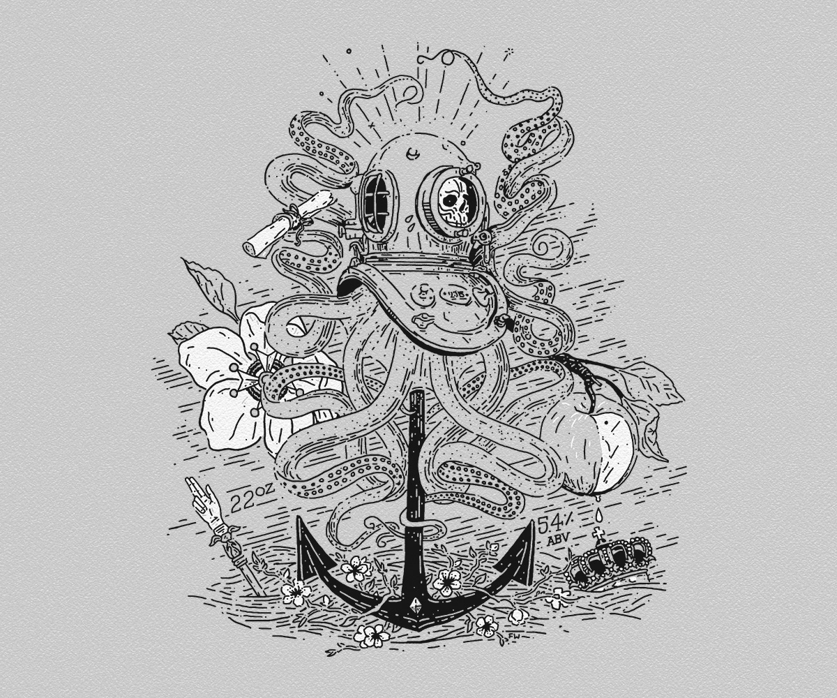
Anchor: 'Crafted with fresh pressed apples, this is our base and the canvas from which our ciders evolve. This is the anchor to the Harvard brand – a balanced, crisp, and off dry take on New England’s tradition of cider.'
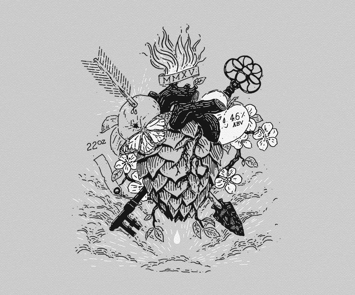
Missing Link: 'The missing link between cider’s traditional roots and craft beer innovation. Missing Link is a wonderfully aromatic, faintly bitter cider created to blur the lines between our two favorite beverages.'
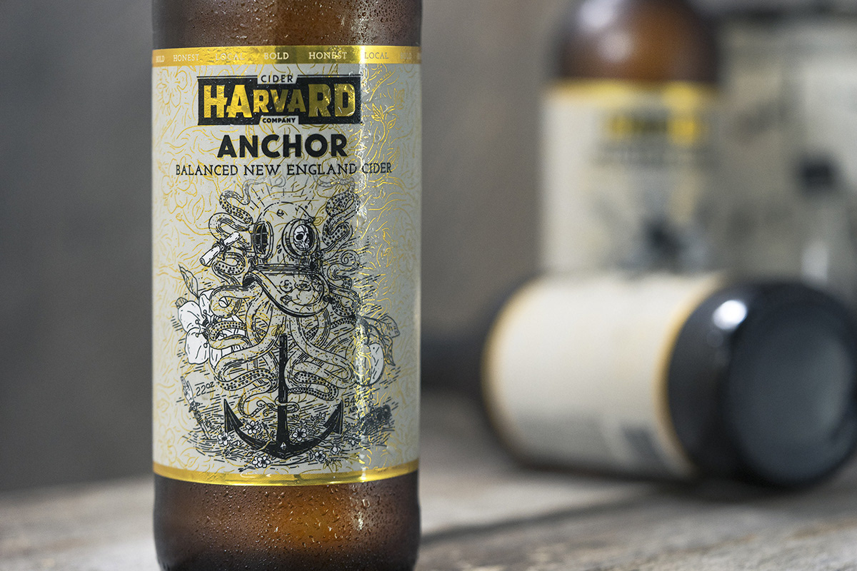
Photo courtesy of Harvard Cider Co.
One of the key challenges with the Harvard brand was to find a balance between the founder's different focuses and helping them define their brand's character through the design process. There were two main characteristics that needed to be brought together, a sense of authentic history and tradition, and a drive for experimentation and bold flavours.
With European migration starting in 1658 the small town of Harvard Massachusetts has one of the New World’s longest histories of apple orchards and cider making. One of the first things we locked in was the need to emphasise this aspect without resorting to watercolour imagery of aged wooden wheels resting against barns, or well-rendered illustrations of each ciders ingredients. Instead, inspiration was taken from detailed pattern work and history itself.
Using a modern illustrative approach, we designed detailed montages of the each ciders character, history and flavour profile. Weird and subtle references abound; from the Italian occupation of the Pepper coast, Belgium royalty, local history and tattoo motifs.
The use of gold and a paired back black, white and grey palette spoke to the quality of Harvard’s product, but also the approachable, modest aspects of the founders.

Photo courtesy of Harvard Cider Co.

Photo courtesy of Harvard Cider Co.
"Tim worked with us from very early on in our company's lifecycle to help develop our brand, and did an incredible job telling our story via our identity & packaging design. We were constantly impressed by his ability to condense & incorporate our story into his work, and this was paramount for us in choosing someone to head up design for HCC. Moreover, his ability to advise on major branding decisions was invaluable. Tim often knew what we needed before we did, and when it came to producing packaging work on a very tight deadline he really came through for us."
Chase Brooks - Co-Founder, Director of Marketing, Harvard Cider Co.