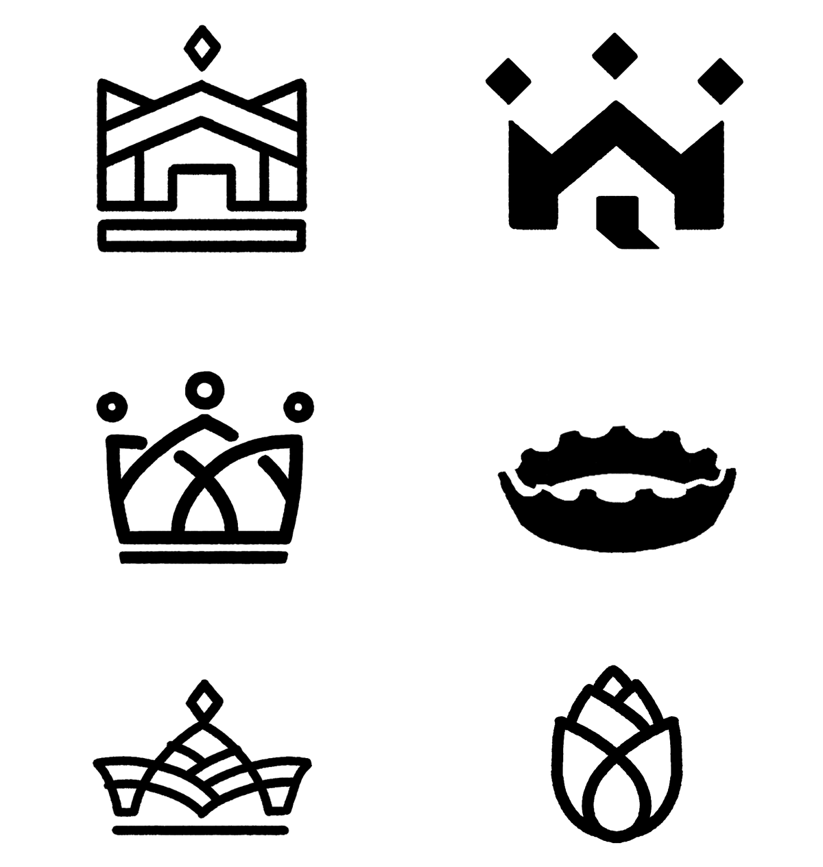
Rough logo concepts, exploring the shape of the building (the 'inn'), playing card crowns, community (figures) and brewing (hops).

The final 'stacked' version of the logo, and it's themes.
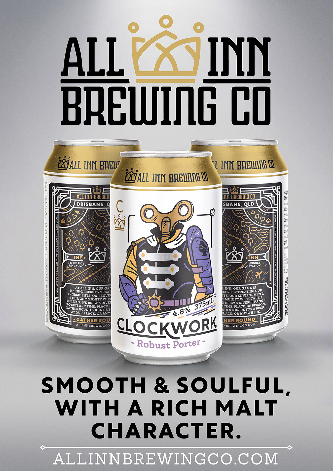
Clockwork, a complex collection of malts that seamlessly combines into a fine-tuned, smooth porter.

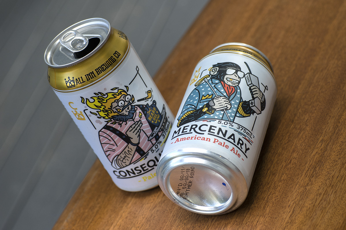
All Inn's American Pale Ale in it's first appearance in cans at the new kit party.
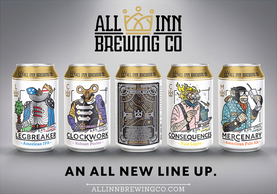
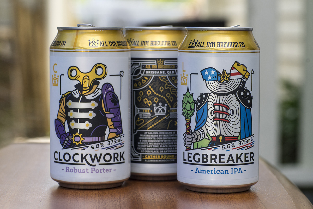
Four of the new All Inn characters in their 375 can formats.
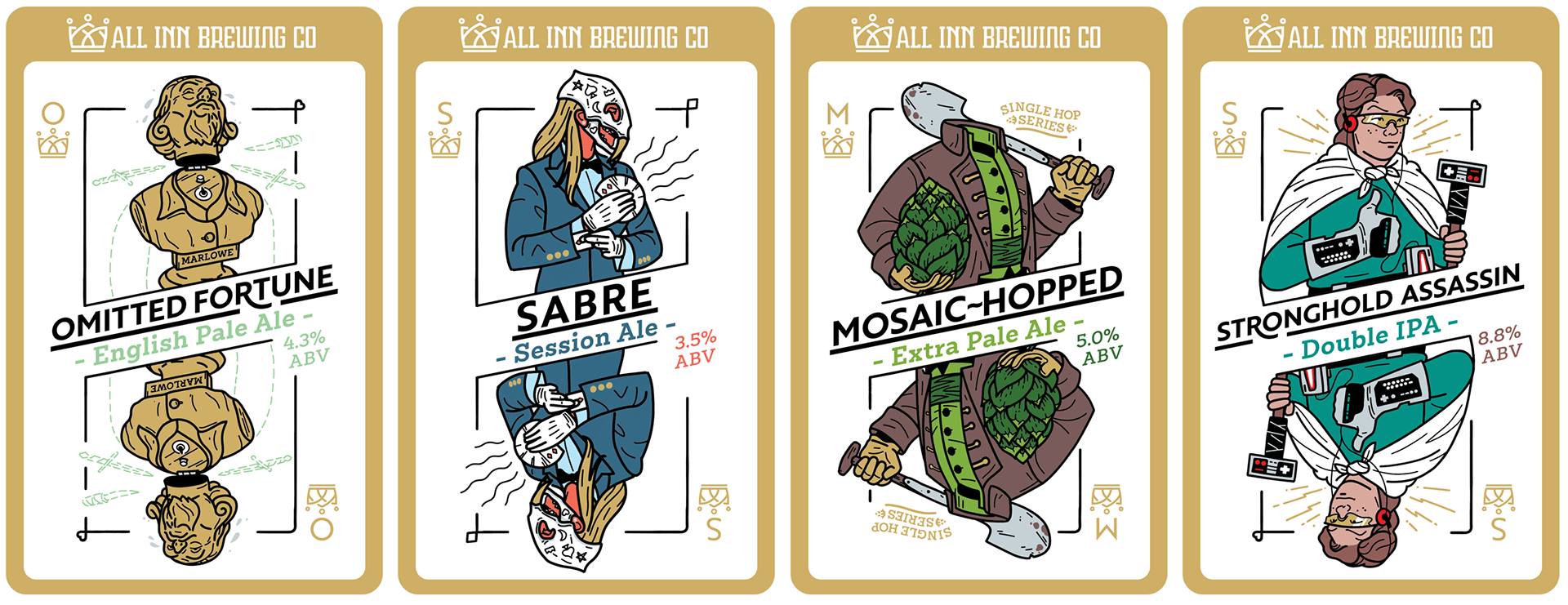
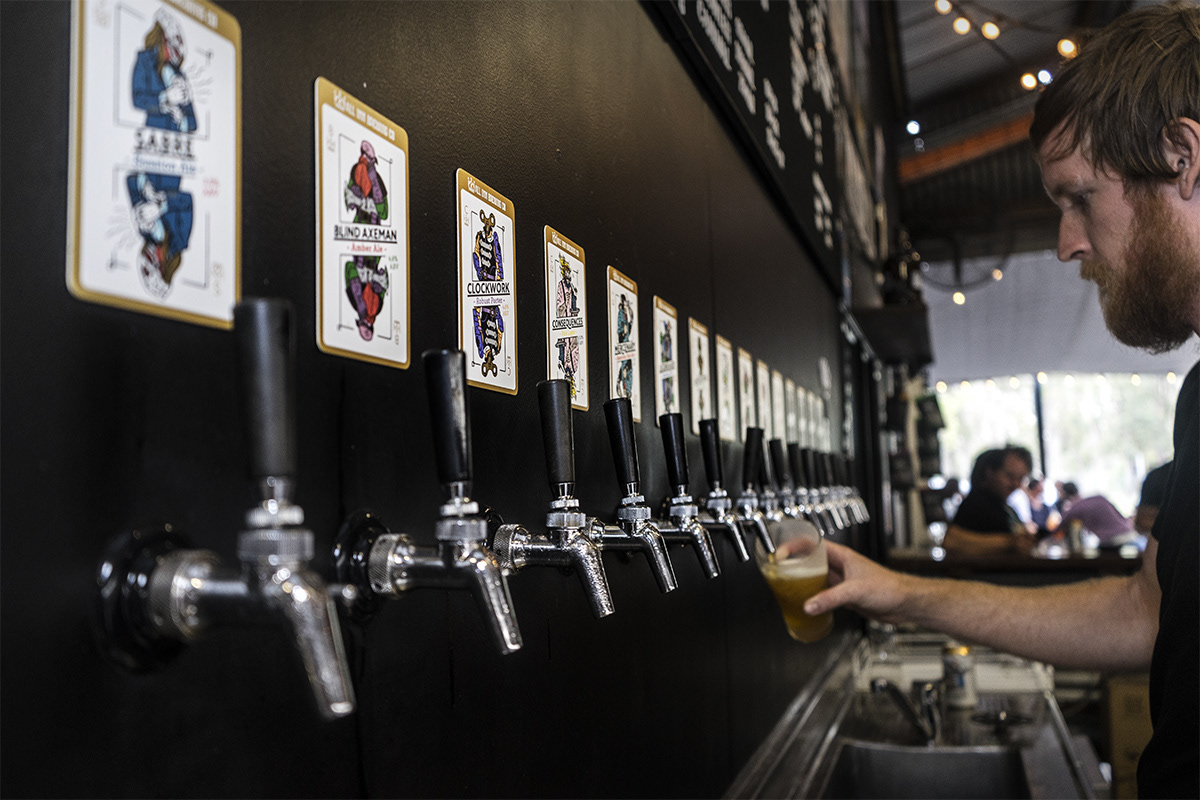
All Inn has been in operation since 2012 and has a large catalogue of beer styles. We created decals for sixteen of their beers for the relaunch and each decal features metallic silver & gold accents on a high-quality card.
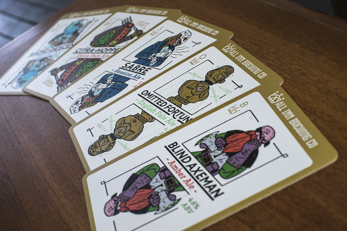
The beer characters range from playful D&D archetypes, pop culture references, 90's gamers and sci-fi mutiners.

All Inn Brewing Co's Fresh Work Kits (FWKs) also got some love, with brand new front, back and top stickers, clearer instructions and better brand presence.
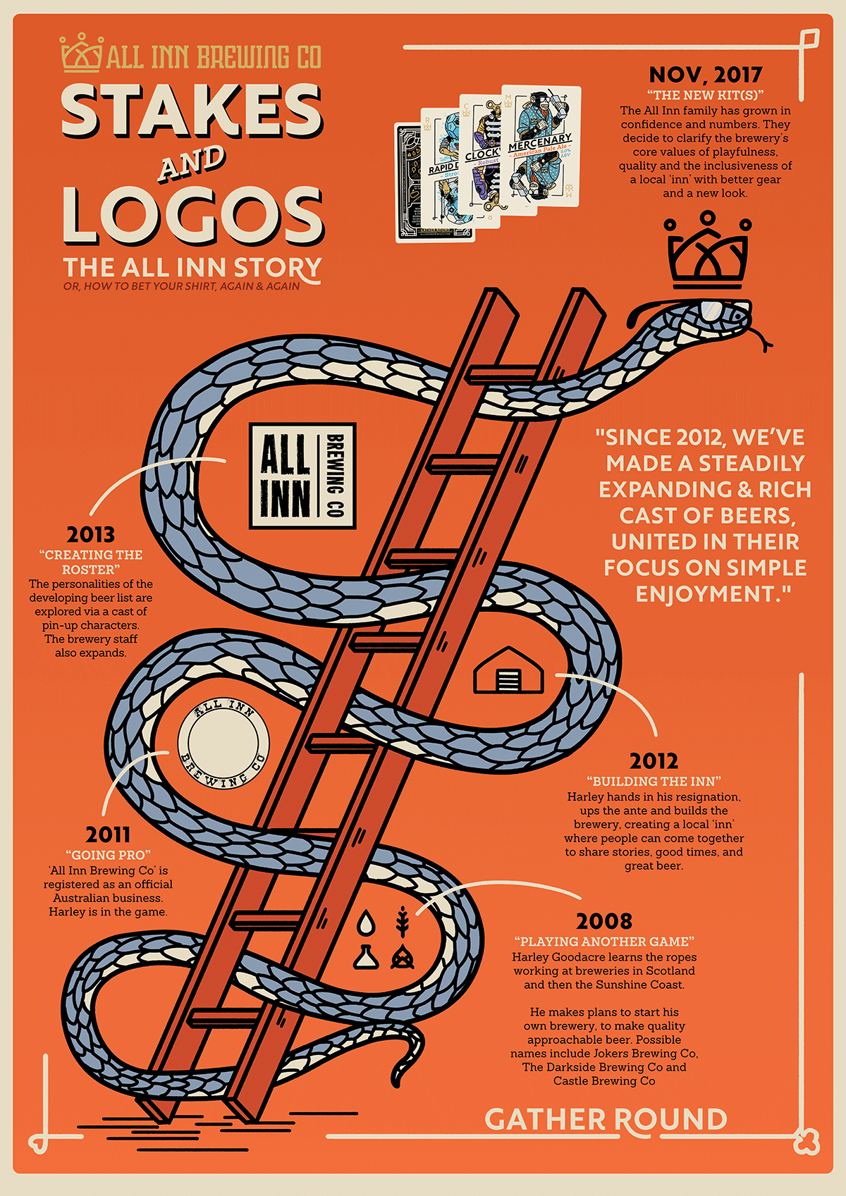
The history of All Inn Brewing Co via the ups and downs of Snakes and Ladders. The use of the game metaphor reinforces the team's focus on playfulness & community.
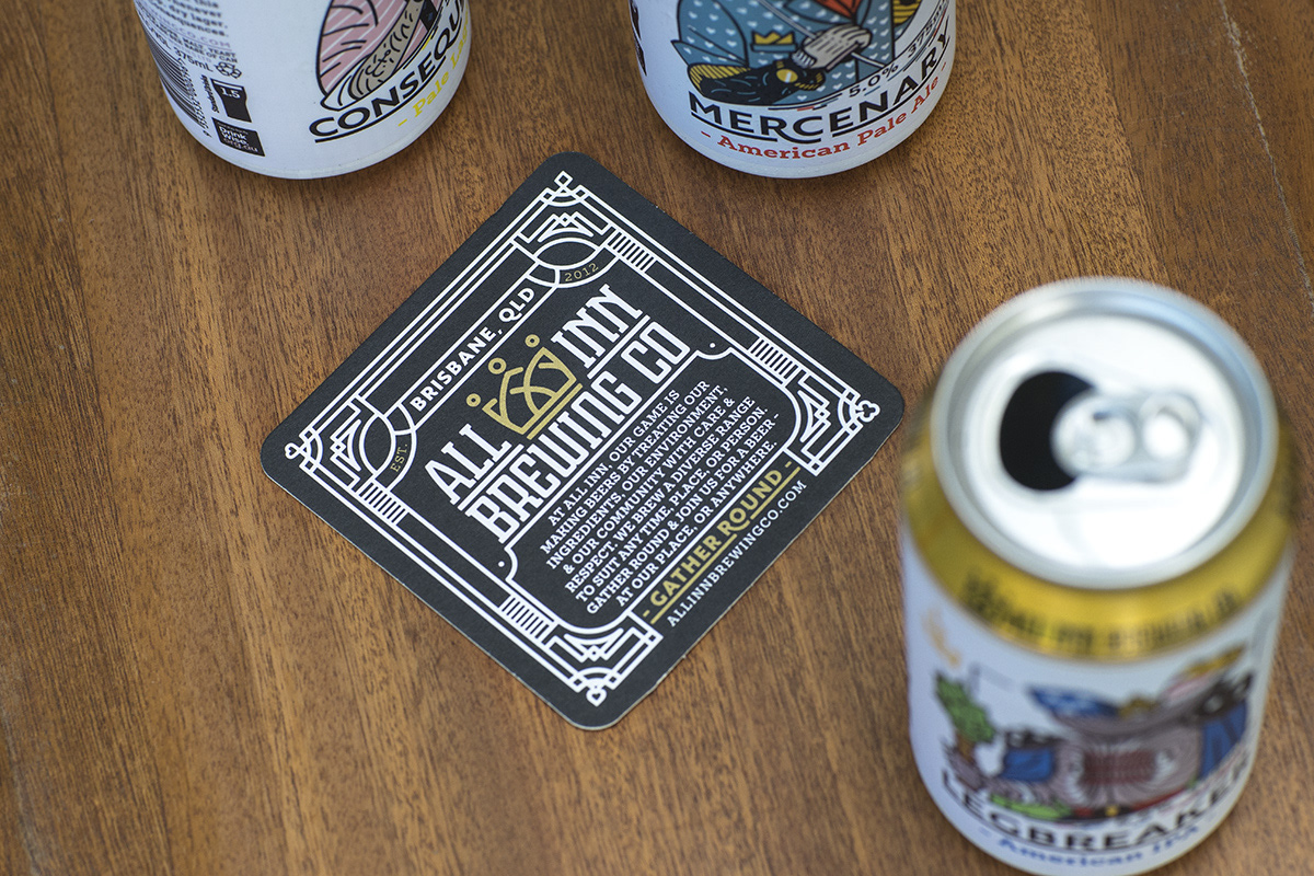
The card back concept has been featured on other collateral, such as this coaster, whipped up by their staff.